7 KITCHENS INSPIRED BY THE COLOUR TRENDS FOR 2020
At Cuisines Steam, we believe that colour is not ephemeral: according to our designers, a harmonious combination of materials, textures and colours always gives a delicate and refined result!
Because we want to share our love for colourful kitchens, we have decided to create a list of 7 Steam projects featuring colourful cabinets, inspired by Benjamin Moore’s colours of the year.
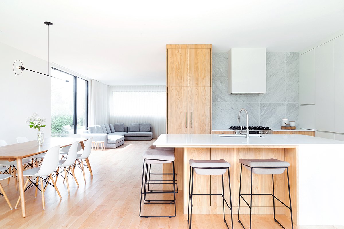
Whether combined with walnut, elm, marble or quartz, White Heron always finds a way to surprise us. Kitchens by Cuisines Steam.
“White Heron is a timeless colour, a sure bet,” explains Brigitte Boulanger, cofounder of Cuisines Steam. “In the spirit of the laboratory kitchen, I love to combine white with contrasts—for example, by adding a touch of warmth with a wood like walnut or elm.” Play with contrasts and materials and you will be sure to get a harmonious result!
This pinkish hue harmonizes perfectly with steel, oak, quartz, granite and brick in this Old Montreal loft. Kitchen by Cuisines Steam in collaboration with Gauvreau Design.
“When you add colour to your kitchen, think in terms of colour blocks. For example, in this kitchen, the block of pink cabinets breaks the rigidity of black and white. A brick wall and works of art complete the look while bringing warmth to the space.” By using the idea of colour blocks, you will avoid overloading your space. Remember, moderation is the watchword when it comes to bold hues!
Crystalline looks great next to the exposed wood beams and stone walls of this ancestral property. Kitchen by Cuisines Steam.
Soothing and unifying, Crystalline is particularly suitable for the warm atmosphere of old houses and country houses. “Both classic and modern, this colour is simply timeless,” concludes Brigitte.
Windmill Wings is the perfect fit for this retro kitchen with checkered floors. Kitchen by Cuisines Steam.
“Neither pastel blue, nor candy blue, nor baby blue, nor too intense, this unique shade adapts well to its environment. It’s interesting to note that this colour changes depending on the viewing angle and the sun that enters the room,” explains Brigitte. No matter how you choose to decorate your space, Windmill Wings will spice things up without a doubt!
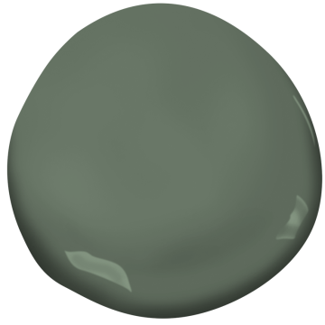
Green cabinets instantly add warmth and personality to this little Montreal kitchen. Kitchen by Cuisines Steam.
Comforting and inviting, Windmill Wings reminds us of the desert and its vegetation. “This is a great option for those who want to incorporate nature into their decor without using wood,” says Brigitte.
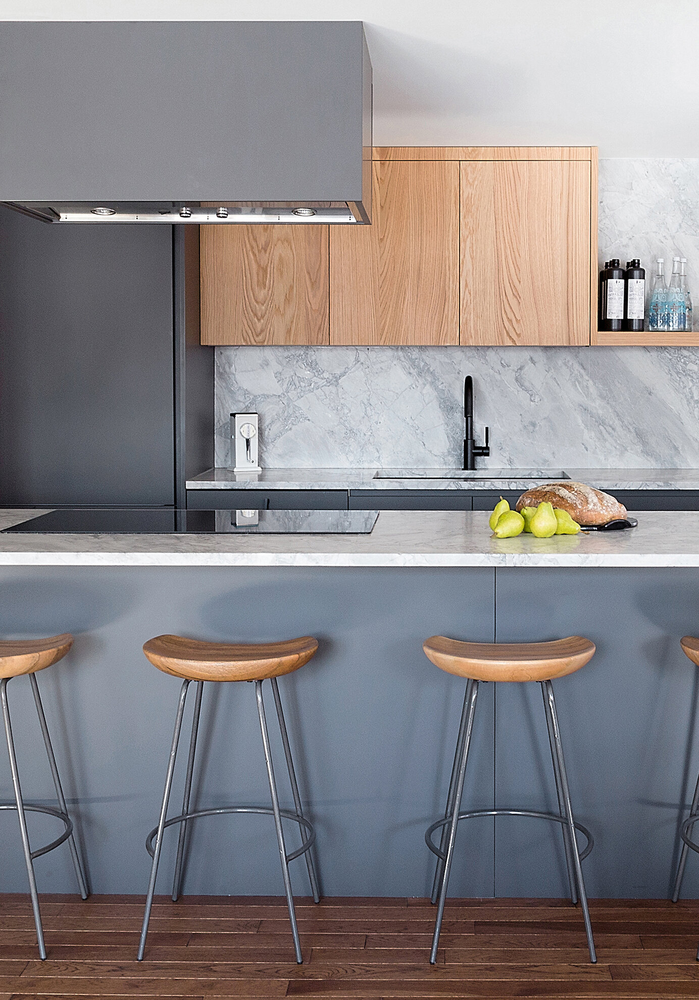
Wood, lacquer and natural stone are the pillars of this design where contrasts are juxtaposed to create a kitchen that is both dynamic and harmonious. Kitchen by Cuisines Steam.
This blue-gray reminiscent of steel is ideal for those who want to add depth to their room. However, this colour should always be mixed with a warm material like wood: “This will avoid giving the room a cold appearance,” says Brigitte.
This elegant blue kitchen is located in our showroom on Saint-Laurent Boulevard. Kitchen by Cuisines Steam.
This colour is often found in classic kitchens, but Blue Danube is also suitable for modern and linear spaces. “This personable colour lends itself particularly well to houses with large rooms and high ceilings,” says Brigitte.
Benjamin Moore’s colours of the year also include Buxton Blue (HC-149), a calming blue-green, Golden Straw (2152-50), a luminous golden yellow, and Thunder (AF-685), a balanced greige (Benjamin Moore). Our designers’ favourite is without a doubt Crystalline, a colour that recently inspired a unique kitchen project with Fisun Ercan, chef and owner of Su restaurant!
If you want to incorporate these colours into your kitchen without embarking on a renovation project, why not choose decorative items like wall art, vases or even kitchen accessories? Don’t forget to take advantage of the adjacent rooms by adding decorative cushions, plant pots or even small furniture (like a colourful corner armchair) inspired by this palette!


